
Every doctor’s clinic tells a story, not just through the care they provide, but also through the way they present it.
For Dr. Shadhana Gothandapani, a general physician and founder of SG Clinic, that story changed the day she switched to a Brittle General Physician Prescription Pad.
The Problem: When the Paper Doesn’t Match the Practice
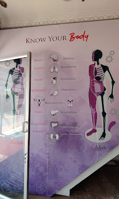
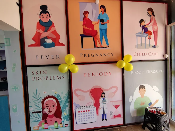
Dr. Shadhana’s clinic is known for its clean ambience, calm pastel walls, and warm lighting that instantly puts patients at ease. But her old prescription pads? A different story altogether.
Like many doctors starting out, she initially printed her pads at a nearby shop basic, single-color sheets on thin paper. They served the function, sure, but didn’t reflect the quality of care or the modern aesthetic of her clinic.
“It felt like my prescriptions were stuck in a different decade,” she added.
And she wasn’t alone. Many clinics in her city used the same generic pads, where design and durability were an afterthought.
The Switch: Discovering Brittle’s General Physician Prescription Pad
When Dr. Shadhana came across Brittle’s general physician prescription pad, she decided to try it and the transformation was immediate.
Her new pads weren’t just printed; they were crafted, premium thick sheets, sharp fonts, specialty-specific sections, and a modern layout that matched her clinic’s ambience perfectly.
Suddenly, the pad wasn’t just a piece of paper. It was part of her brand.
The Impact: A Small Change, Big Difference
Within the first month of using her new Brittle pads, patients began to notice. Pharmacists handled the prescriptions with more care, often folding them neatly before returning them to patients.
Even small details like the doctor’s registration number, signature space, and drug allergy disclosure line added an element of professionalism that built patient trust.
“I realized this is the only thing patients take home from my clinic,” she said.
“It represents me when I’m not around.”
And she took it one step further, maintaining carbon copies for records, ensuring transparency and continuity of care.
Compared to other clinics that didn’t even hand out prescription copies, SG Clinic’s approach felt refreshingly transparent. Patients appreciated it and soon, word spread.
The Result: From Clinic to a Mini-Hospital Vibe
With her upgraded prescription paper design, SG Clinic began to look and feel more like a small hospital.
Patients felt confident in her approach, not only because of her medical expertise but also because of the professional presentation of her practice.
Within months, Dr. Shadhana noticed a visible increase in new patient flow, not through advertising, but through trust.
“People started referring me saying, ‘She’s so organized and clear.’ That’s when I realized design also heals in its own way,” she added with a smile.
Beyond Design: Building Trust One Sheet at a Time
At Brittle, we believe that every detail counts, from the ink to the texture of the paper.
A prescription pad isn’t just stationery; it’s a doctor’s business card, reputation, and memory all in one.
Patients may forget your clinic board, but they always carry your prescription sometimes even for years. That’s why your pad deserves the same thought you put into your stethoscope, logo, or consultation room.
The Takeaway
Dr. Shadhana’s story shows how something as simple as upgrading your general physician prescription pad can elevate your entire practice.
It’s not about luxury — it’s about identity, professionalism, and patient trust.
And we’re proud at Brittle to have been a small part of that transformation.
Because sometimes, the paper you prescribe on says as much as the words you write.